TagFit Size Charts for POD
Setup guide
Get an accurate size guide button on every Printify product page in three steps. No theme code required — the setup takes about two minutes.
Add the app block to your theme (one time)
Open your Shopify Theme Editor, navigate to a product page template, and add the Size chart (POD) block from the Apps section. You only need to do this once — it applies to all products automatically.
- Go to Shopify Admin → Online Store → Themes → Customize
- In the page dropdown at the top, select Products → Default product
- Click Add block in the left sidebar, open the Apps section
- Click Size chart (POD) to add it
- Click Save
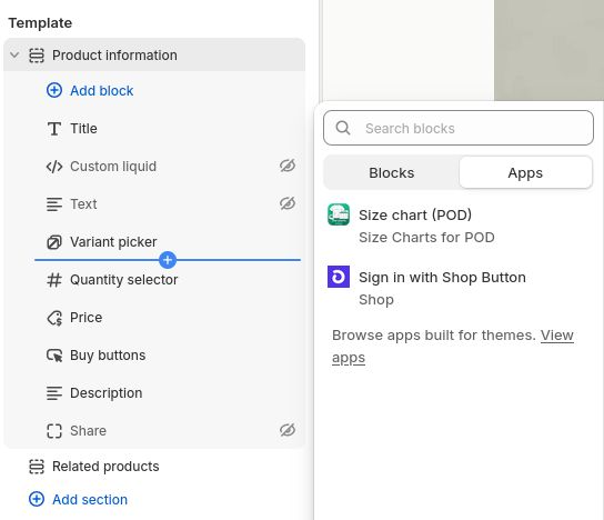
The Size chart (POD) block appears under Apps in the theme editor.
Find your product's tag in the app dashboard
Open the app dashboard and search for your product. Each product has a unique tag — copy it with the copy button.
- Open TagFit Size Charts for POD from your Shopify Admin → Apps
- Use the search box to find your Printify product by name or brand
- Click the copy icon next to the tag (e.g. sizechart-gildan-unisex-softstyle-t-shirt)
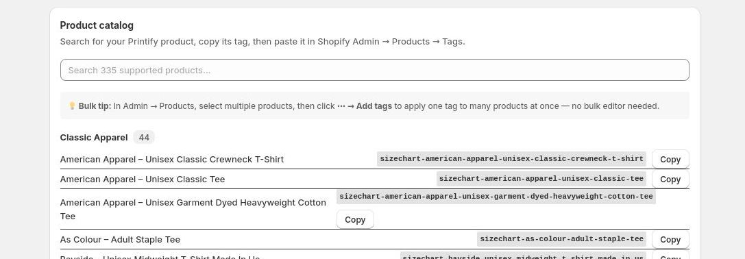
Search your product, then click Copy next to its tag.
Paste the tag on your Shopify product
Tags are how the app connects a product to its size chart. Paste the tag you copied in Step 2 onto the product in your Shopify admin.
- Go to Shopify Admin → Products
- Open the product
- Scroll down to Tags and paste the tag
- Click Save
That’s it. The size guide button will appear on the product page immediately. Repeat Step 3 for each product — no theme changes needed again.
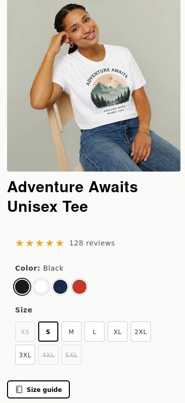
What your customers see
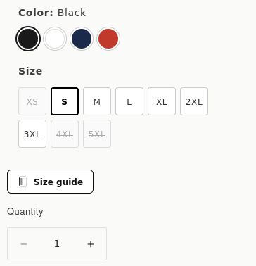
A Size guide button appears on every tagged product page. Customers click it to open a measurement table and toggle between inches and centimeters.
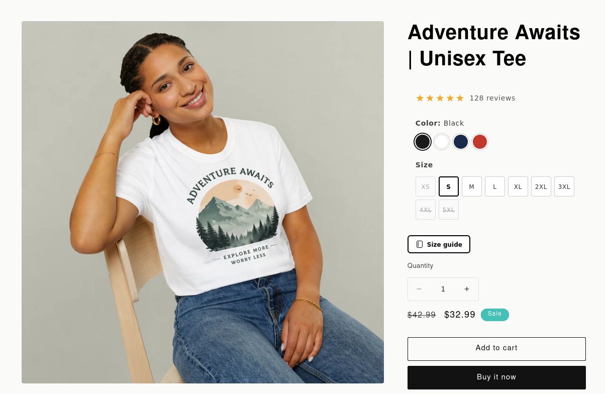
Size guide button on a desktop product page
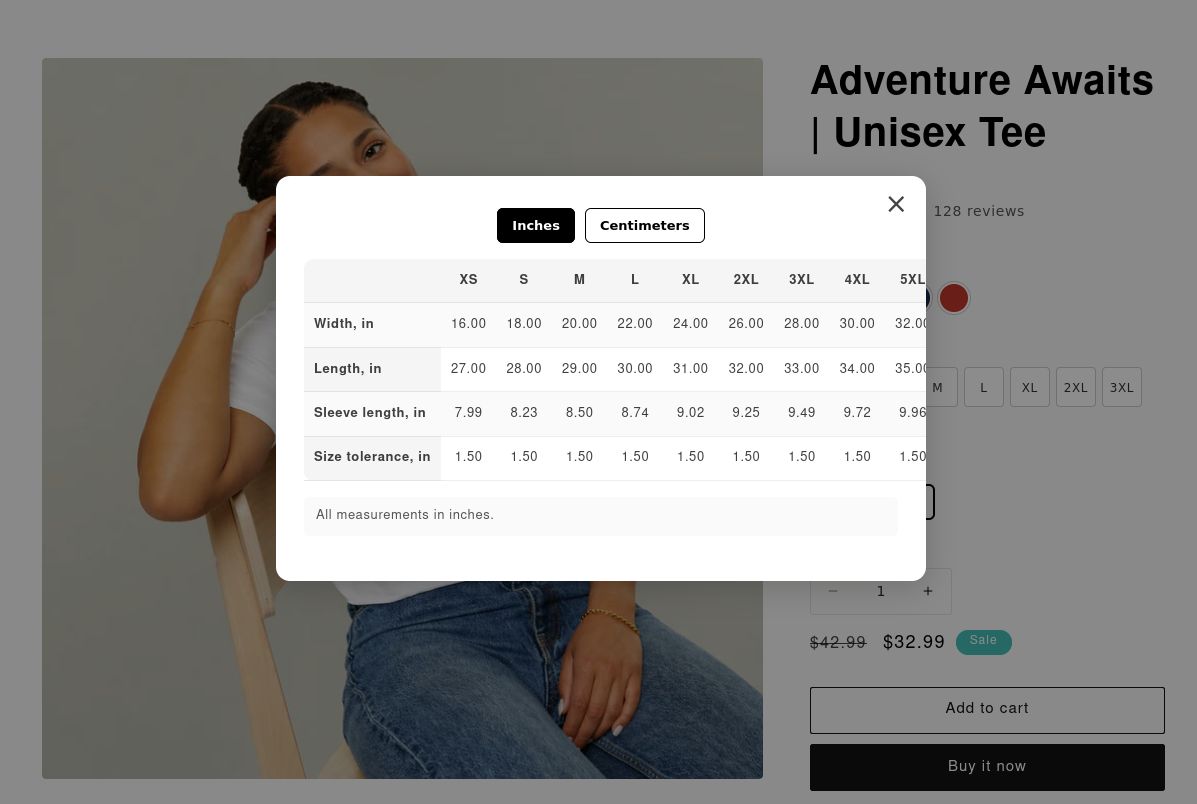
Measurement table — inches view
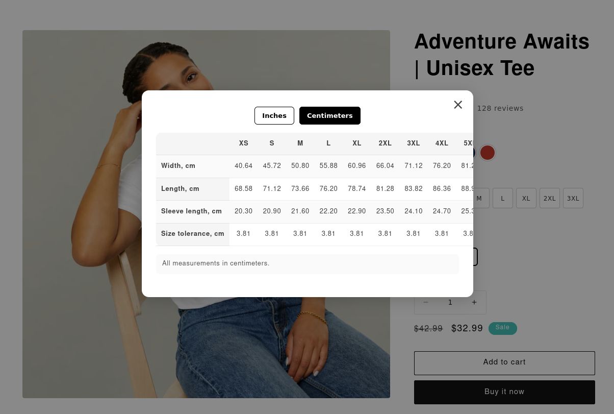
Same table — centimeters view
Works on mobile too
The button and modal are fully responsive — no extra configuration needed.
Mobile product page
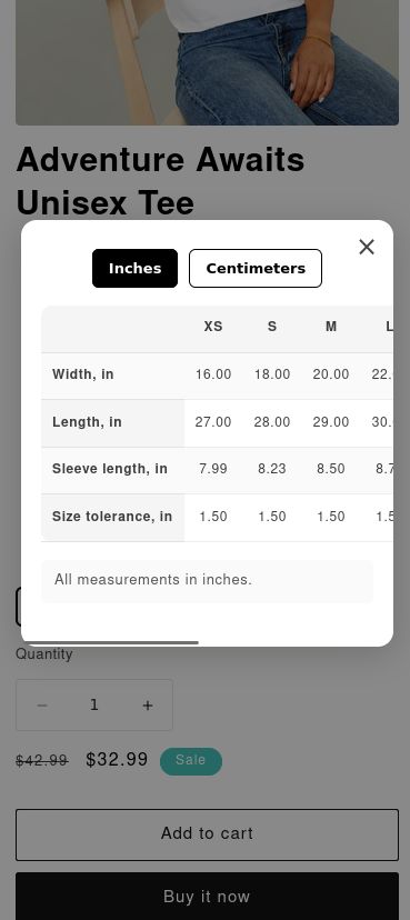
Mobile modal — inches
Customize the button
Open the theme editor, click the Size chart (POD) block, and adjust any of these settings — changes are live instantly in the preview.
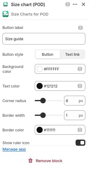
All settings in the theme editor panel
Button label — rename the trigger text (e.g. "Measurement guide", "Sizing info").
Button style — choose Button for a filled/outlined trigger, or Text link for a lightweight underlined link that takes no visual space.
Background & text color — match your theme's palette.
Corner radius — 0 px for sharp corners, up to 24 px for a pill shape.
Border width & color — set width to 0 for no border, or increase it for an outlined look.
Show ruler icon — toggle the ruler icon on or off.
Button style — outlined with border
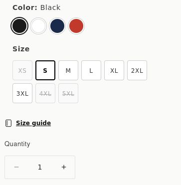
Text link style — minimal, inline